About Portfolio Blog
  • Plot showing the percent change in caffiene and calories as the sizes of the starbucks chais increase
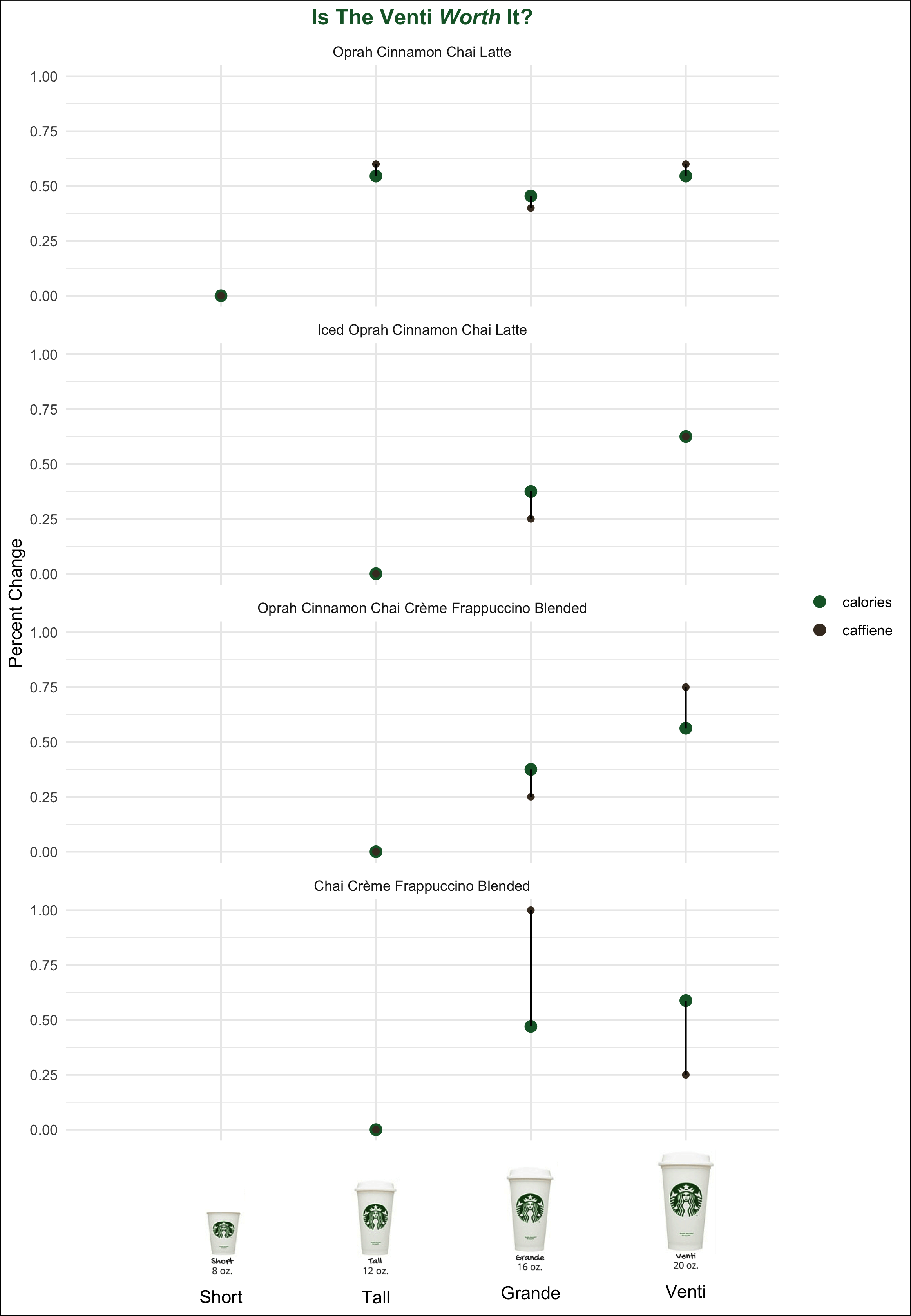
    TidyTuesday Starbucks Chai
  • Rank-Rank Hypergeometric overlap map of the expression profiles of purifies SST+ and PV+ cells in the Nucleus Accumbesn 35mins after Amphetamine treatment
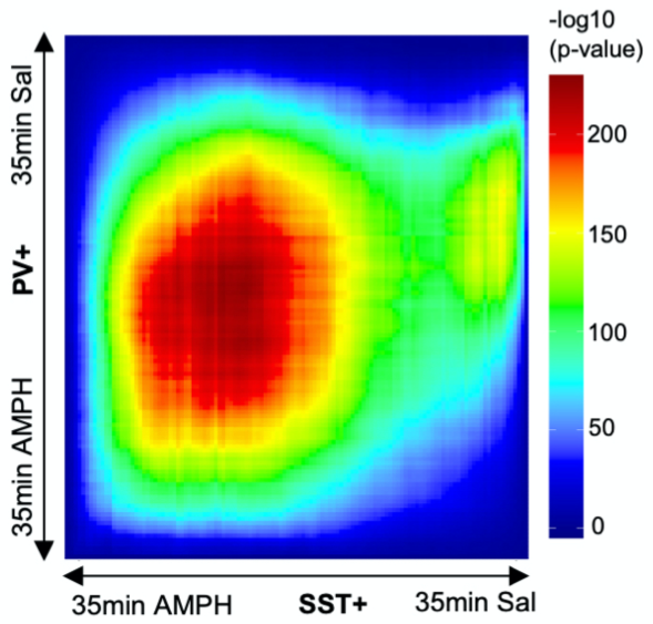
    Rank-Rank Hypergeometric overlap of gene expression profiles
  • bar chart showing the average windmill heights in the different provinces of Canada
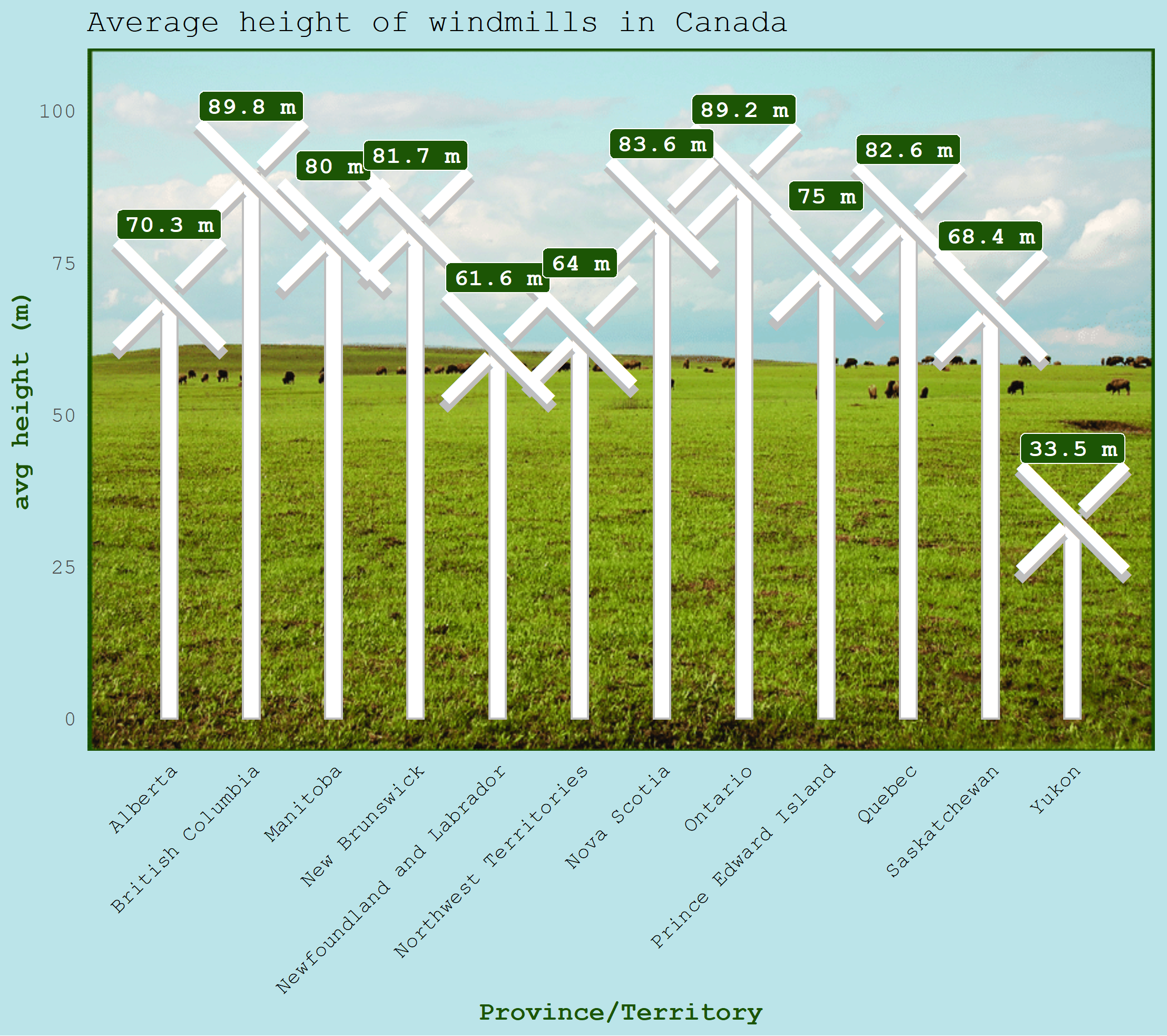
    Canadian Windmill heights
  • Diagram of pilot dashboard for environmental health factors in North Carolina
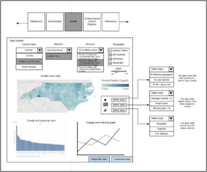
    Pilot Environmental Health Tracking Dashboard
  • Gif of points on a graph that have roughly the same summary statistics but distributed wildly different
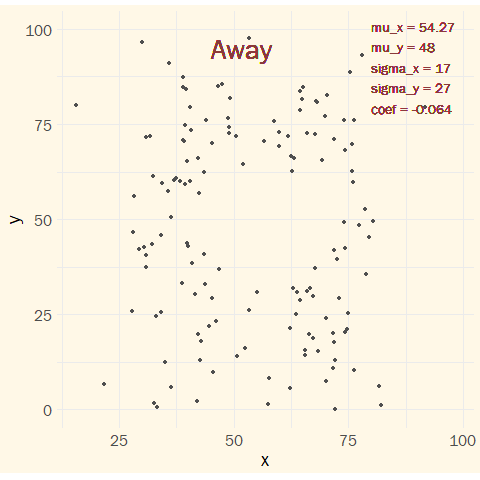
    Deceptive Summary Stats
  • bar plot showing the number of beer awards NC breweries received from 1987 - 2020
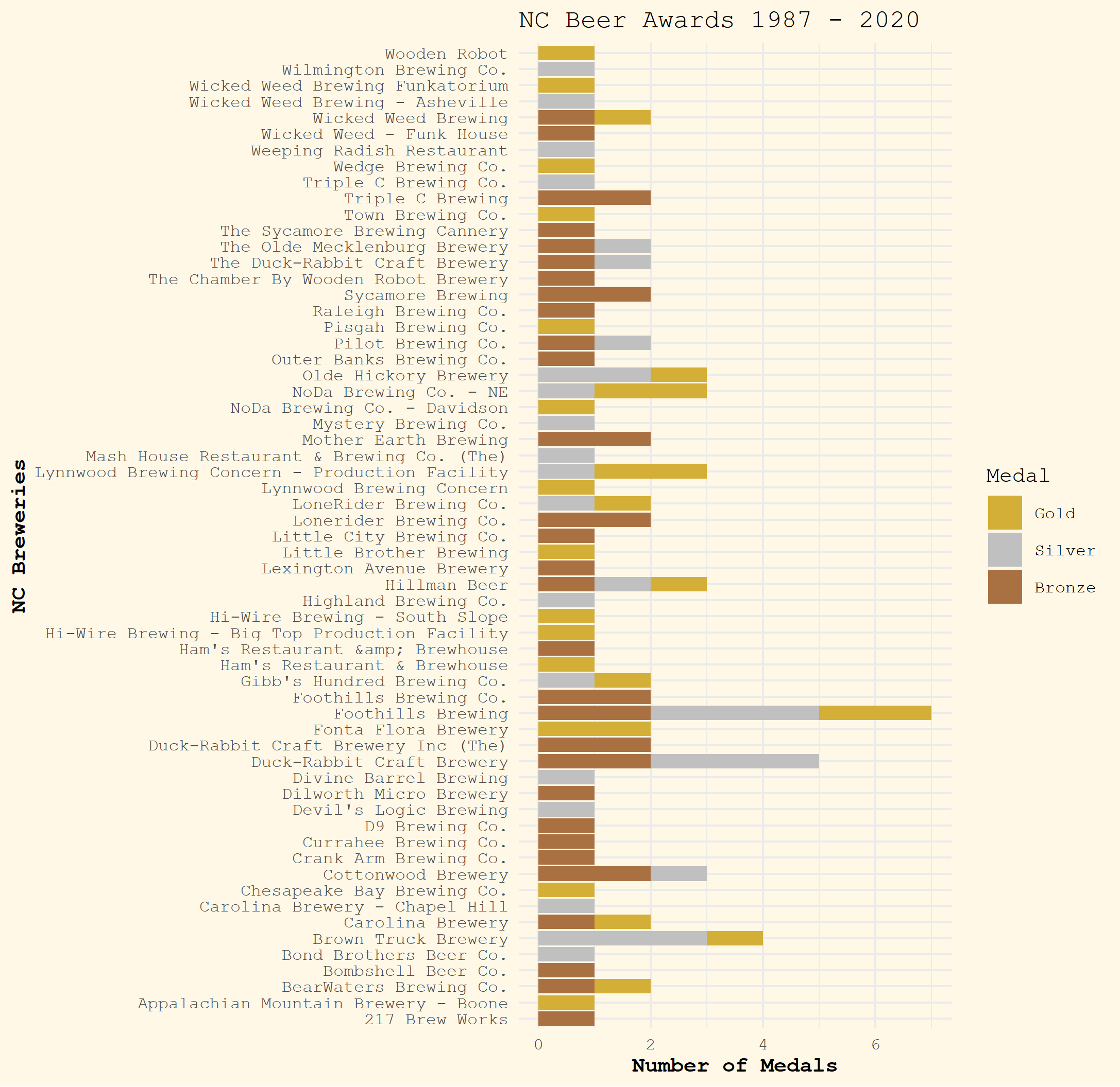
    North Carolina Beer Awards
  • corrlation plot of expreesion profiles of nueornal samples
    Customize corrplot()
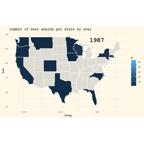
  • gif showing the number of beer awards per state from 1987 - 2020
    U.S. Beer Awards
google scholar profile
linkedin
tweeter
github
OrcID